“There’s an app for that!” has served as a rallying cry for techy individuals for the past 15 years. The first iPhone was released in 2007, 16 years ago, by Steve Jobs. Steve was a visionary; he released a product well ahead of its time. The world, and the app store, could not come anywhere near understanding it. Over time, users became more comfortable with their new phones, and developers became creative. Novelty apps began to spring up. Waiting in line at the deli counter? Flappy bird. Waiting for drinks with your buddies? iBeer. Slowly, apps began to shy away from glorified tech demos, and became moderately useful. PDF scanners, dslr emulators, shitty ports of popular, yet dated, video games. Even full scientific calculators, which gave my TI-84 Plus CE a run for its money. This was Steve Job’s App Store.
2011. Steve is dead. Time’s arrow marches on. The crown of Tech Tzar now rests on the head of Tim Apple. Under Tim’s regime, techy individuals are still echoing the sentiment of an app for everything, but it’s become quite hollow over the years. There’s been a shift in the very ideology of the app store. It was once envisioned as a democratic library for anyone to publish their own software, but no longer.
The app store of today is far sleeker than the one I grew up with. Tim snuffed out the warm and amber wood-fueled flame of democracy long ago. He replaced it with a soulless blue propane flame of capitalism. It’s hotter, with absolutely none of the charm. The apps tend to be unoptimized, slow, and chock full of popup ads. There’s a dearth of passion projects: I haven’t downloaded an app out of interest or joy in over five years.
There’s still an app for that. If you keep your ears peeled, you will hear the same words every once and a while. But they’re no longer uttered by techy individuals. They’re spoken by the blissfully ignorant, excited that their company has produced an app that we all know need not exist.
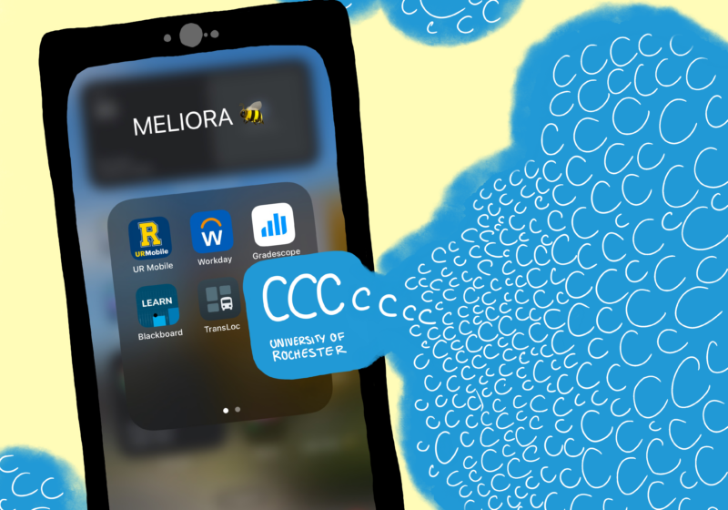
CCC ONE is utterly pointless. Wait a second… This is an app for facilitating car repairs. Okay, now I found it. Under the same color scheme and even font, UR CCC is the second result on the AppStore when searching for “CCC.” That should express its relevance quite well. The only reason for the average student to open it is to have their QR code scanned for events. But why can’t that be part of the Student ID keycard we all have to carry with us at all times? Or why isn’t it part of the litany of other apps we have to download, like CampusGroups, UR Mobile, or even Blackboard?
It’s getting really, really hard to remember which half-assed app to use for what. I propose a solution. Every year, the University comes out with a single app that covers all aspects of campus life. To ensure confusion is no worse than the current clusterfuck, UR should adopt an n+1 naming scheme. n=n+1, where n=c. The first year, everyone downloads C, for campus. Then CC, for Campus Center. By year seven, you could download Campus Center for Catering Cuisine to Children and Council of Conveniences!
Stop making pointless apps. There’s nothing wrong with a decent website and there’s so much wrong with the labors of Silicon Valley computer science feed farms.


