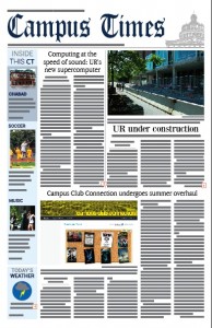
Courtesy of campustimes.org
While you were relaxing and getting a tan this summer, the Campus Times was busy receiving a much-needed facelift. Hopefully, the first thing you noticed when you picked up this issue was that, well, the entire paper bears no resemblance to its old self.
We — the editor-in-chief and the presentation editor — have spent the past three months taking a hatchet to the CT’s design and layout, and then rebuilding it from scratch. We don’t expect anyone outside of the CT staff to be intricately familiar with the details of our design or layout processes, so we’d like to first give you the background information on what changes have been made to the paper and why.
The overarching impetus for this drastic, comprehensive redesign was that the staff as a whole felt that the aesthetics of the paper no longer reflected the fact that the CT is an up-to-date medium on which students can rely for important information regarding UR.
Much of the old design was a holdover from what was established back in 2006, but certain parts, such as the weather graphics, were clip art from the 1990s.
Taking the templates for our beloved paper, scrapping them all, and staring back at blank pages, waiting for inspiration, is terrifying. How do you even begin to approach a project like that?
We decided that our first action should be to redesign the headplate, which serves as the initial representation of a newspaper to any reader. It is a visual representation of everything a newspaper stands for.
For those who remember our old headplate, it lacked personality, and didn’t say much about us as an institution. The improved one you see on the front page today, however, stands to symbolize our three goals: a commitment to remaining modern, a connection to our history, and our dedication to the university we serve.
The cleaner font of the date, issue and motto, as well as the presence of our website’s address connect to the first goal, the old-style font of “Campus Times” embodies the second and the emblem of Rush Rhees Library holds us to the third. Believe it or not, establishing this structure in the headplate paved the way for the entire rest of this much-needed redesign.
The analogy is this: When you go out to eat, if your food is arranged in an off-putting way, you won’t want to eat it no matter how good it might actually taste. Likewise, if a newspaper is designed in an unattractive way that makes it hard for readers to get something from its pages, then no one will want to read it, no matter how good the content actually is.
This redesign and its goals, from the start, were based on one main motto: keep it simple. Readers will notice that our articles are easier to read because we’ve changed our body copy (the font in which articles are printed) and increased its size. The newspaper is no longer littered with dozens of mismatched fonts, but instead will feature a total of six fonts used in various contexts. We’ve made easily visible previews on the front page so it will be simple to tell what’s featured inside the paper before you even open it fully. We’re employing more white, open space in our layout, which not only makes it easier for editors to assemble their pages, but is also for the benefit of you, the reader, by making the paper more accessible and less overwhelming to read.
The list of changes goes on much further, but we won’t list them all here; you can see for yourself by combing through this issue.
We hope that the overall impression you get from it is that your student newspaper is not stagnant and outdated. It is fluid and current, and it exists to provide you with accessible, important information in an aesthetically pleasing way.
Melissa Goldin is a member of the class of 2013.
Julia Sklar is a member of the class of 2014.

